
There is a growing awareness among horse owners about the importance of horses being turned out together. Horses are herd animals. They need social contact. So what is the reality for today’s domesticated horses? What are people’s horse husbandry practices around turnout?
Horse Talk – horse husbandry: the science of breeding, rearing, and caring for horses.
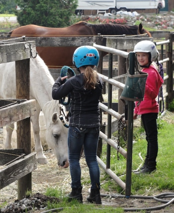
These horses are kept in separate paddocks.
Although research tells us that living outdoors is ideal for the health and well-being of horses, full time turnout is not always an option, and even if it were, some horse owners would not choose it.
Research also shows us that horses do better when allowed to socialize. Unfortunately, many horses are kept alone in separate paddocks or corrals.
A poll asked horse owners about their horse’s turnout. Do they get turned out at all? Are they turned out alone, or with other horses? One thousand two hundred ninty-three people responded to the poll. Let’s take a look at what the poll revealed.
1. Imagine you are the person researching this question, create a title for this pie chart.
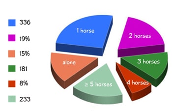
2. What does each section of the chart represent?
The poll gave horse owners different options to choose from, from horses being turned out by themselves to horses being turned out with five or more other horses.
3. Which option was chosen the least in the poll?
4. Which option was chosen the most in the poll?
5. How many respondents said their horse was turned out with two other horses?
6. How many respondents turned their horse out with 4 other horses?
7. What percentage of the respondents’ horses are turned out with three other horses? Give your answer to the nearest whole number.
Click to enlarge
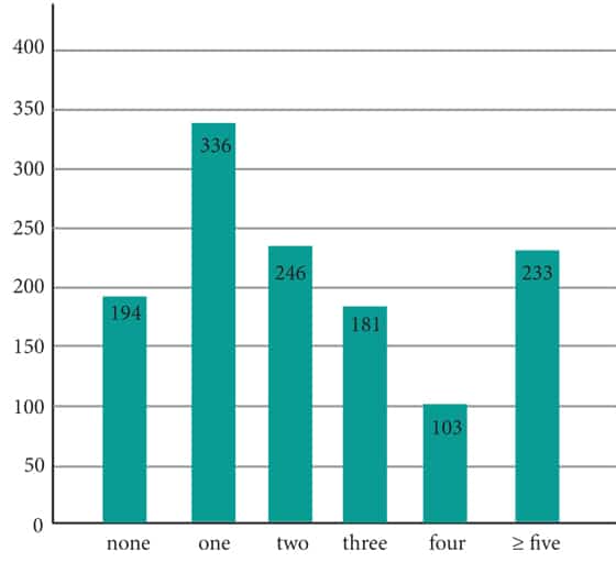
Let’s look at this same data displayed differently.
8. What kind of graph is this?
9. What data is displayed on the Y-axis?
10. What data is displayed on the X-axis?
What do you notice about these two graphs? Is it easier for you to compare data with one graph more than the other? Some graphs are better than others for displaying different kinds of data.
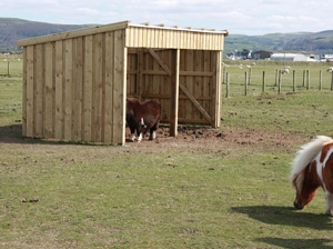
run-in shelter
Pie charts are generally used to show percentage or proportional data and usually the percentage represented by each category is provided next to the corresponding slice of pie.
Pie charts are good for displaying data for around 6 categories or fewer. They do not show changes over time.
Bar graphs are used to compare things between different groups or to track changes over time.
Math Talk – proportional: When two quantities always have the same size in relation to each other. For example, 1 halter costs $25; 2 halters cost $50, 3 halters cost $75, and so on. The two quantities being the number of halters and their cost.
Some of the respondents described their choices. One horse owner commented, “My horse plays too hard if he’s out with multiple others, so he has one babysitter.” Another had her two horses on 24/7 turnout with a run-in shelter.
11. Horses that are turned out 24/7 spend how much time outside?
One horse owner described her horse’s turnout situation this way, “. . . plenty of room for play and grazing, the more the merrier. Horses are happier in herds.” Lucky horses!

1. Imagine you are the person researching this question, create a title for this pie chart.
Answer: There is no one right answer to this. Whatever you choose, you want readers to know quickly and easily, what the data is about. The survey asked horse owners how many horses their horse is turned out with. A simple choice for a title might be to let readers know the data is from a poll, and what the question was. Poll results: How many other horses is your horse turned out with?
Did you come up with a different title? Share it in the comment box below.
2. What does each section of the chart represent?
Answer: The number of horses the respondent’s horse is turned out with.
3. Which option was chosen the least in the poll?
Answer: The fewest number of respondents turn their horses out with four other horses.
4. Which option was chosen the most in the poll?
Answer: Most people turn their horse out with one other horse.
5. How many respondents said their horse was turned out with two other horses?
Answer: 1293 (total number of respondents) × 19% = 1293 × .19 = 245.67. Two hundred forty-six people turned out their horse with two other horses. Because the question asks how many people, and you can’t have a part of a person, the answer must be rounded to the nearest whole number.
6. How many respondents turned their horse out with 4 other horses?
Answer: 1293 × 8% = 1293 × .08 = 103.44. One hundred three people turn their horse out with four other horses. Did you remember to put a ‘0’ in the tenths place?
7. What percentage of the respondents’ horses are turned out with three other horses? Give your answer to the nearest whole number.
Answer: 181 (number of respondents who turn out their horse with 3 other horses)/1293 × 100% = 0.139; 0.139 × 100% = 13.9%. Fourteen percent of the respondents turn out their horses with three other horses.
8. What kind of graph is this?
Answer: Vertical bar graph
9. What data is displayed on the Y-axis?
Answer: Number of respondents
10. What data is displayed on the X-axis?
Answer: The number of other horses.
11. Horses that are turned out 24/7 spend how much time outside?
Answer: 24/7 refers to 24 hours a day, 7 days a week. In other words, they’re outside all the time.
Common Core:
4.MD.B – Represent and interpret data.
5.NBT.A – Understand the place value system.
5.NBT.A.4 – Use place value understanding to round decimals to any place.
5.MD.B – Represent and interpret data.
6.NS.B.3 – Fluently add, subtract, multiply, and divide multi-digit decimals using the standard algorithm for each operation.
6.RP.A.3c – Find a percent of a quantity as a rate per 100
Photos:
Two horses in field; Public Domain
Horses in separate paddocks by Deborah Stacey; CC BY 4.0
Horse shelter by Kat Dodd; CC BY 2.0


